
“I just wanted some fridge magnets…”
What began as a simple 3D printing project quickly turned into an accidental dive into Penrose tiling, geometry, colour theory… and very late nights.
When I moved into my house, I bought a fridge freezer. A Miele, with lovely stainless steel doors. It looked lovely—clean lines, brushed steel—but a bit… bland. I didn’t want the door banging into the wall, so I used some magnets as little buffers. It worked. Kind of.
The magnets didn’t look that good, though. But it got me thinking.
Fridge magnets could be fun. Might even jazz the place up.
So I looked online. Most fell into one of three categories:
- Kiddie-core – bright plastic animals, letters, chaotic energy.
- Boring-but-practical – whiteboard magnets for notes, functional but dull.
- Everything else – an overwhelming soup of slogans and bad jokes in Comic Sans.
Then I found some I liked: bamboo wood hexagons. They were okay. But: small. Pricey. At that rate, covering my fridge would cost a grand.
Plus, let’s be honest—20 hexagons in and the novelty wears off. Hexagons aren’t the pinnacle of magnet design. They’re like the Ikea end of patterns.
If only there were more interesting fridge magnets out there…
Something elegant. Something beautiful. Something that would make a mathematician weep into their Earl Grey.
One evening I was lying on my sofa, staring into my lava lamp, pondering what I had come to think of as The Great Fridge Magnet Quest.
Not just a domestic decor decision. A puzzle. A design mystery. A problem that had plagued humankind (well, me) for weeks.
I’d recently bought filament with wood fibre—it looked and felt like wood. Maybe I could 3D print some hexagons. Stick a magnet on the back.
But then I thought: Why stop at hexagons?
If I was going to make my own magnets, I could make them any shape I wanted. Something interesting. Something truly worthy of my fridge.
Somewhere in the lava glow, the phrase “weird tiling patterns” shimmered into my consciousness. I grabbed my phone. Googled. Clicked.
And there it was:
Penrose tiles.
Simple. Elegant. Infinitely complex. Perfect.
I put my phone down, quite pleased with myself.
I had no idea the Pandora’s box I’d just opened.
The rabbit hole I had just stumbled into.
Sir Roger Penrose is a flipping legend.
He’s a mathematician, but honestly, that label barely scratches the surface. The guy’s dabbled in physics, philosophy, and art—too many fields to count. You’ve probably heard his name before: maybe from the Penrose triangle, that mind-bending “impossible” shape? Or the Penrose stairs—those never-ending steps made famous by Inception?
Now, let’s talk tiling.
In mathematics, a tiling pattern means covering a surface—wall, floor, fridge—with shapes that fit perfectly, no gaps, no overlaps. Think of using squares or hexagons. Some patterns mix a combination of shapes, like octagons and squares.
The thing about most of these patterns? They repeat. See one bit, you’ve basically seen the whole thing. Make a stamp from it, tile away, and boom—you’ve covered the surface. This is called periodic. And frankly? It’s a bit boring. It’s why I didn’t want to cover my fridge in hexagons.
Then came the big question:
Could there be a tiling pattern that never repeats?
In 1974, Sir Roger Penrose said: “Hold my chalk.”
He discovered what are now called Penrose tiles—a non-periodic tiling pattern using six shapes. Then he found another set using two. And another. Eventually, he figured out how to generate infinitely many sets of tiles that fill space in a non-repeating way.
And yeah, my brain still struggles to believe it. But it’s real.
Which leads to a new problem:
If there are an infinite number of non-repeating tiling patterns…
Which one do I put on my fridge?
I have enough trouble choosing between two types of carrots in Tesco’s.
Now I’ve got infinite options? I needed to pick one. Quickly.
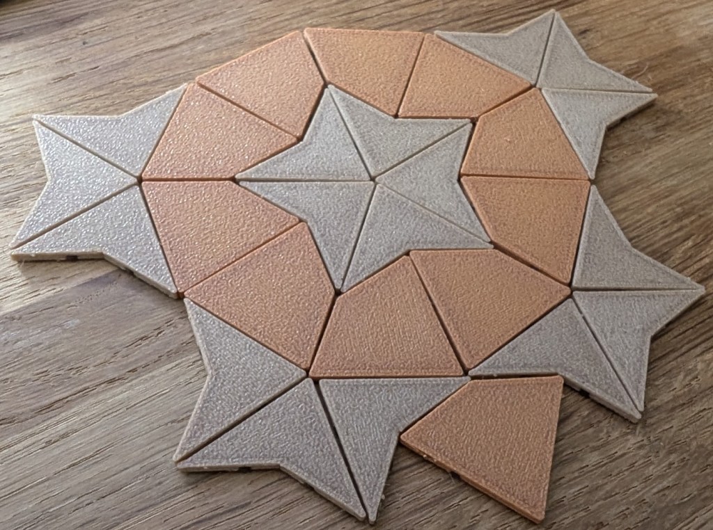
The tiling patterns have names. P1, the first tiling set discovered by Sir Roger Penrose, has six tile shapes and seemed a bit fiddly.
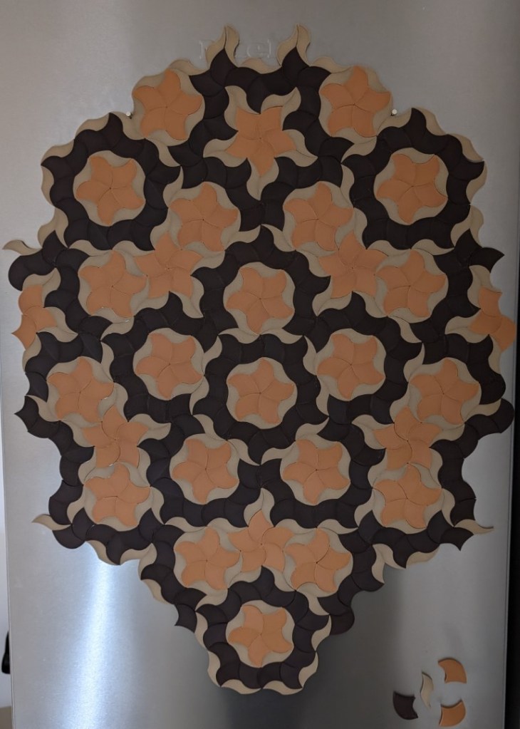
I modeled and printed the P2 tileset. There are two tiles: a kite and a dart. This pattern is really cool. The darts look like shining stars, and the kites resemble planets. I imagined the kites in a blue-black color and the darts in a lighter tone. This pattern doesn’t seem very popular—but I really liked it.
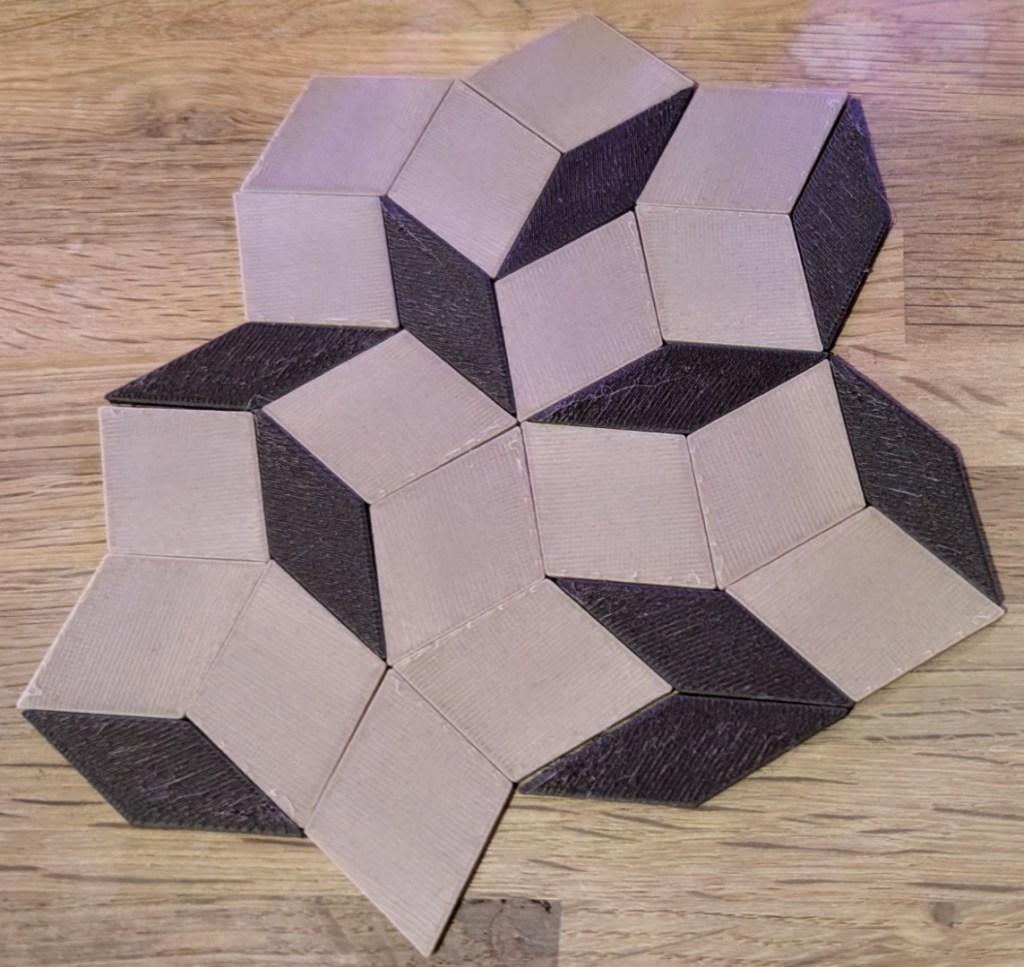
Next, I created and printed the P3 tiling pattern. This one uses two rhombi: thick and thin. This is the most popular Penrose pattern. It’s very geometric and creates a nice 3D effect, like stacked cubes or a cityscape. I loved this pattern too, but I wanted something less pointy, a bit more unusual.
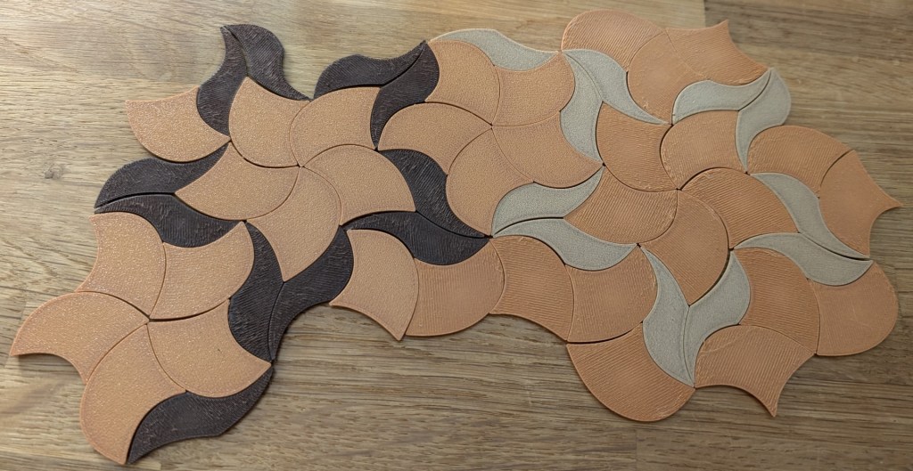
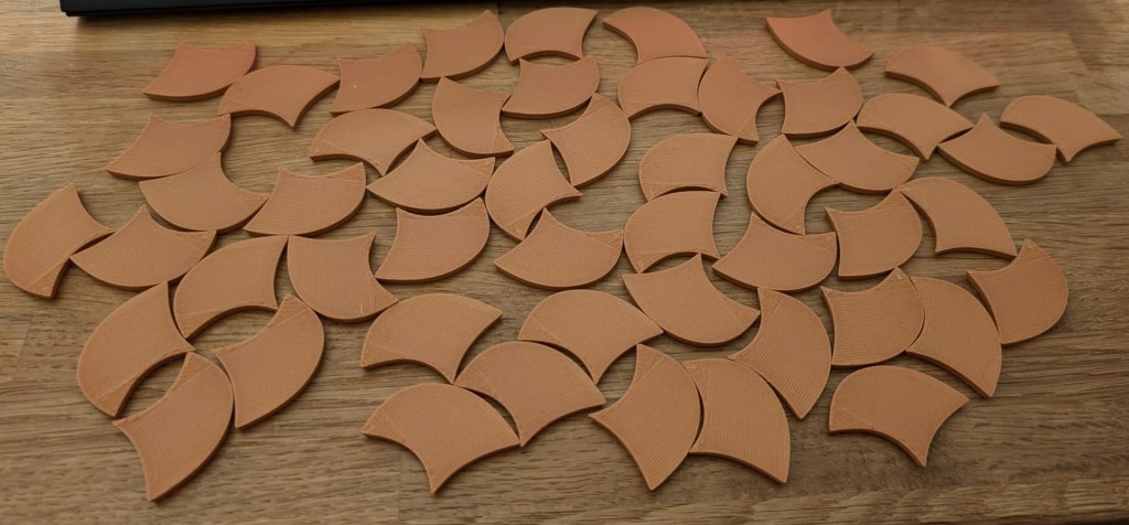
Finally, I printed a version of the P3 tiles using parabolic curves. It’s amazing how this pattern is based directly on the P3 set but looks completely different. Instead of being geometric and angular, this version feels curvy and natural.
The shapes remind me of starfish surrounded by seaweed. The pattern looks organic but is still based on precise geometry. There’s a semi-symmetrical quality to it that I find really appealing. It’s like something both natural and unnatural at once.
I’ve always been drawn to things that live in that space between order and chaos — the precision of maths wrapped around something that feels alive. There’s something calming about it. Like you can see the rules, but you can also see them bending just enough to make beauty happen.
It’s possible to tweak the curves, but I loved the smooth parabolic look and stuck with that shape.
Phew! It took weeks to design and print test pieces from all those type sets. I thought I was done. We print the tiles now, right?
Um, no.
Let’s talk about a special kind of attraction. You know when you’re drawn to something by an invisible force. You don’t know why — you just know you were meant to be together.
Yes, magnets.
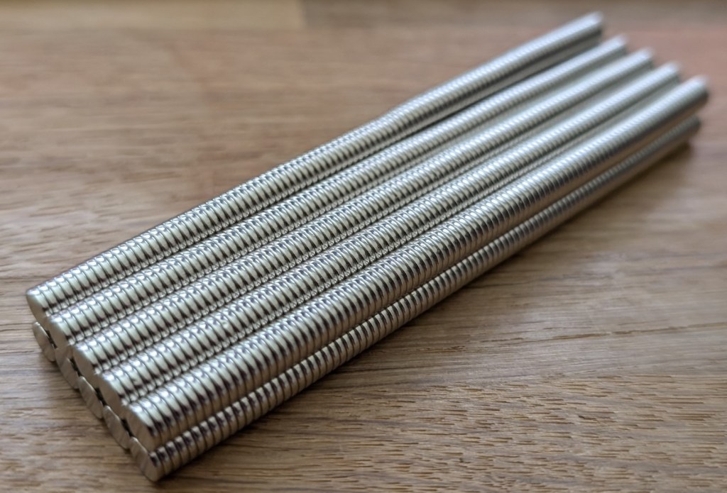
To cover one fridge door, I reckoned I’d need about 1,000 tiles. So… 1,000 magnets.
Next, I had to attach them to the tiles. I had two choices: I could glue the magnets on — quick and easy, but tricky to remove later. If the tiles didn’t work out, the magnets couldn’t be reused easily.
Or I could design a compliant mechanism to hold the magnet. More effort, sure, but I could pop them out anytime.
I went with the mechanism. It took ages, but I’m glad I did. The design made the tiles a little thicker, but the magnet sat flush and looked neat.

Next: colours and material.
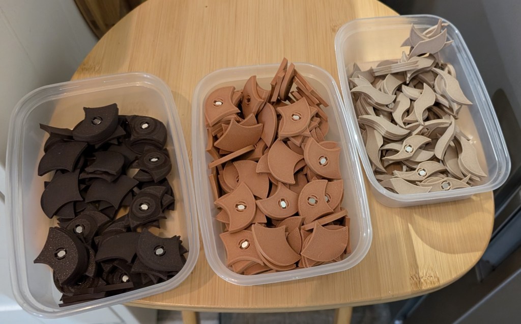
I hate the plasticky look and feel of PLA. I would never cover my fridge in bright, shiny plastic bits. But I had filament with wood fibre in it — and it looked like actual wood.
It didn’t look like it had been 3D printed. I had three colours already and thought doing two colours for each tile might work, so I needed one more.
I dug out some burnt titanium PETG. It had a cool vibe. I was going for an underwater theme, and the burnt titanium had that deep-sea shimmer.
I paired the pine/titanium combo for the smaller tiles, and the brown/orange combo for the larger ones.
I had no idea what size to make the tiles. So, I guessed. Randomly. I had no clue how the pattern would turn out. It could be stunning. It could be dreadful. But I had to find out.
This whole thing had dragged on for weeks, but I kept going. I needed to see it.
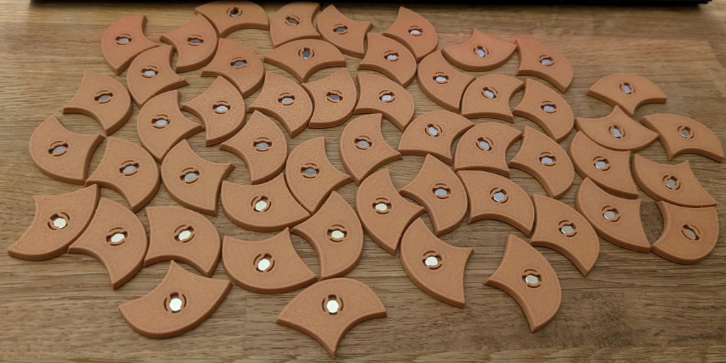
Then the epic task of printing began. It went on for days. Each print would make maybe 25 tiles in a couple of hours.
I had my printer running all day and night. It was like having a newborn—I’d have to get up every two hours to change it.
I would pop off all the pieces and keep them in Tupperware containers. Then in the evenings, I would push in all the magnets. The magnets were light and very strong. They’d often jump out of the tiles and fly across the table, despereate to be with another magnet friend.
Eventually, I had about 300 tiles. It was time to fit them on the fridge. Cool!
I had no instructions, no idea what the finished pattern looked like, and no clue where to start. So, I started with a random tile.
The tiles don’t fit together in just any orientation, so I had to try different combinations and sometimes backtrack. I didn’t want the pattern to be too matchy-matchy, so I tried to randomize the tile colours.
I did a patch and sent it to long-suffering Robin. He said it looked good. I was like, “No, this looks awful.”
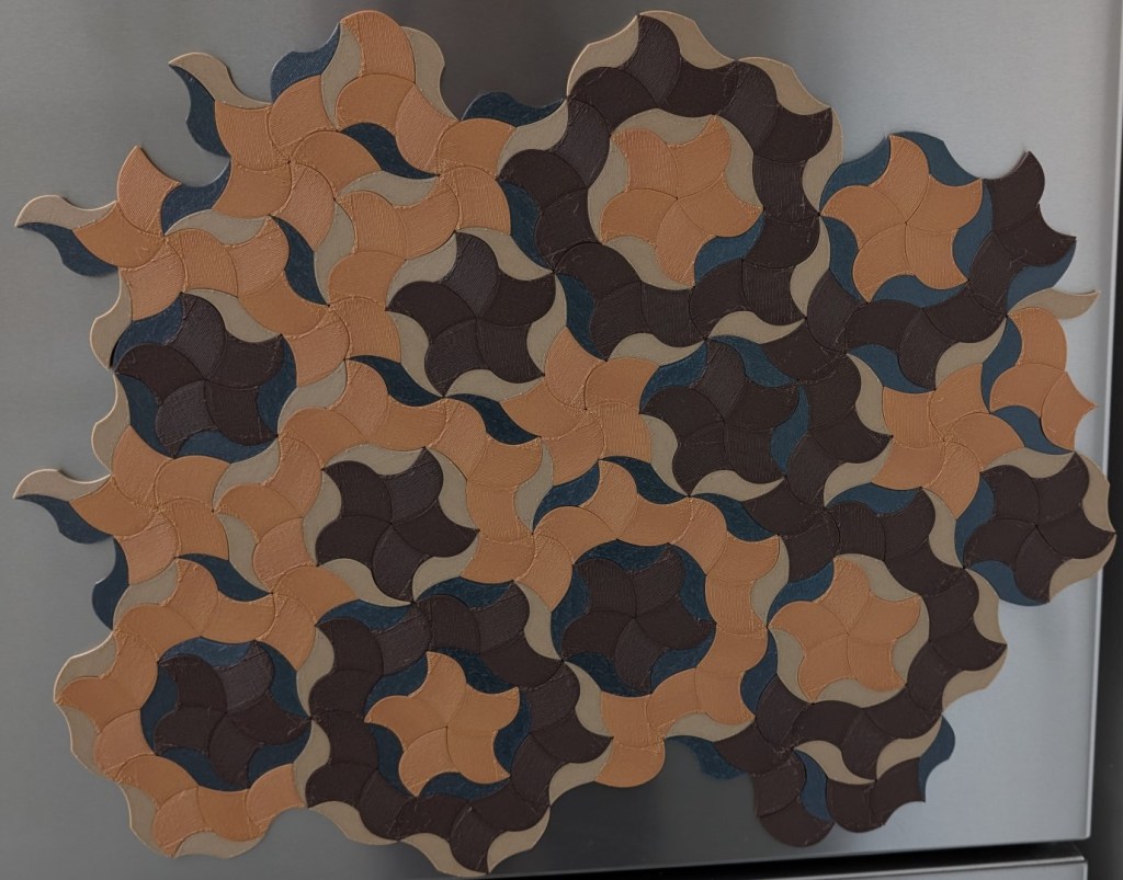
So I rejigged things. First, the burnt titanium tiles didn’t look right. They stood out—and not in a good way. Plasticky and not in keeping with the other colours that were more pastel. So I got rid of them. I didn’t have another colour to use, so all the thin wavy tiles were now the same colour. It looked a lot better like this.
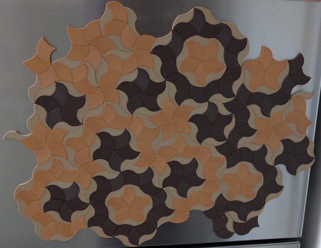
Next, I looked at the orange and brown tiles. They also didn’t look good when randomly assigned. So I updated the rule: tiles next to each other with the same shape should be the same colour. This looked better.
I had tried to make it more chaotic, but it looked better the more ordered it became.
The pattern had starfish-like shapes and a wiggly border that looped around them. That wiggly border was the most interesting bit, in my opinion, so I wanted it to stand out. I used dark brown tiles for the wiggly lines and orange tiles for the starfish.
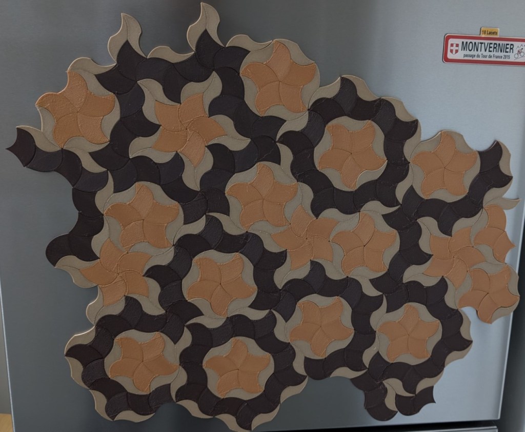
Finally, while working on the pattern, I noticed a line of semi-symmetry. I reoriented the whole pattern so that line ran vertically.
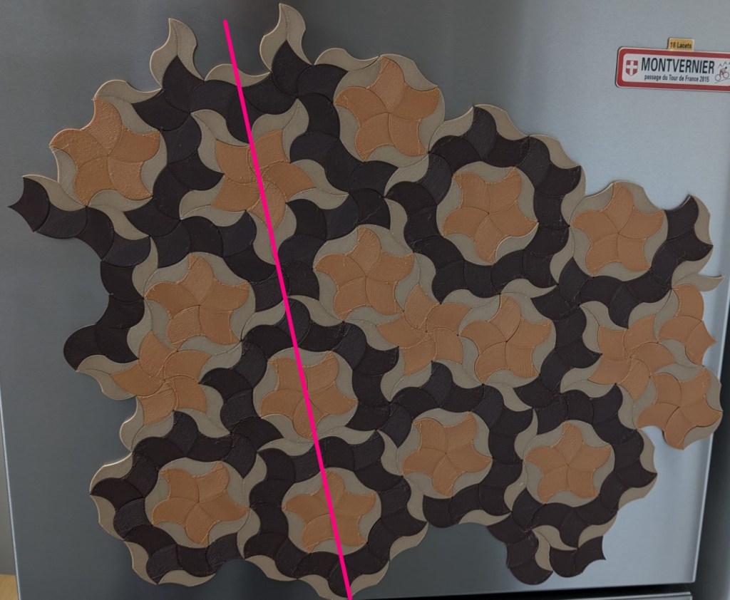
That looked much better. It’s amazing how a few small adjustments made such a massive difference. After the first version, I wasn’t sure about continuing, but once I’d made these tweaks—I thought it looked great.
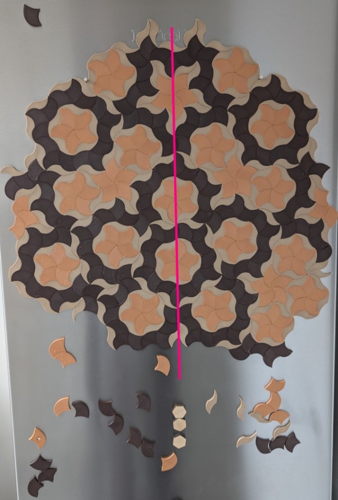
My plan was to add a few tiles while waiting for dinner to cook and build it up gradually over days or weeks. But I really wanted to see the whole pattern. I got carried away one night and did the whole thing. It was 4am by the time I had finished.
It looked awesome.
One man. One fridge. Infinate geometry.
When I started making these fridge magnets, I didn’t know how they would look.
I didn’t know if I’d even like the result.
At first, the pattern didn’t look good. I could have stopped there.
But the idea was still good.
A non-repeating pattern.
Something that would never quite settle into predictability.
That was worth pursuing.
The tiles don’t repeat.
But the process did.
I kept adjusting. Tweaking colours. Shifting layouts. Adapting the pattern right up to the very last tile.
It was only when I stepped back that I saw it properly.
I love how it turned out. The colours, the tension between organic and geometric, regular and irregular. It feels both discovered and designed.
I’ve experienced this before, when the first version doesn’t work out.
It is easy to think that’s the verdict.
It can’t be changed.
But it isn’t.
The ending isn’t predetermined.
The answer might be different. Better.
Because it can be shaped. Nudged. Iterated.
All the way through.
Turning into something surprising and unmistakably mine, yet somehow more than I expected.
After it was over, I stood in my kitchen looking at my fridge.
Relieved that it’s now done.
I love it.
Then, I glanced down.
The plain steel freezer door stared back at me.
So anyway, I bought another 1,000 magnets.


Leave a comment